Key Takeaways
- Visual choices made at street level influence how customers judge a business before any interaction takes place.
- Design direction, materials, and colour all contribute to whether a brand feels premium, approachable, or contemporary.
- Different environments and audiences respond to different visual cues, making context an important factor in design decisions.
- Well-considered visual communication supports visibility, clarity, and long-term brand recognition in busy commercial settings.
Introduction
In Singapore’s busiest retail corridors, transport hubs, and commercial districts, attention is a limited resource. Customers form impressions in seconds, often before consciously registering a brand name. This is where signage style becomes a decisive factor. Beyond visibility, it quietly communicates positioning, pricing expectations, and brand confidence. In environments where customers are often moving quickly or navigating unfamiliar spaces, signage also plays a practical role in guiding movement and reducing hesitation. In high-traffic environments, visual choices influence whether a business feels relevant, credible, or easy to overlook.
Minimalist vs. Maximalist Signage
Businesses often gravitate toward either restraint or expressiveness, and each approach sends a distinct signal to passing customers. The effectiveness of either approach depends largely on whether the visual message aligns with the expectations of the surrounding environment and target audience.
Minimalist Signage
A minimalist approach relies on clarity and visual restraint to establish confidence and focus.
- Clean typography and controlled spacing
- Neutral or muted colour palettes
- A composed, professional visual presence
This direction is commonly seen in corporate offices, clinics, and boutique retail spaces where trust and professionalism matter. From a behavioral perspective, this aligns closely with consumer psychology in branding. Simplicity is often associated with quality and reliability. Minimalist signage also reduces visual friction, making it easier for customers to identify entrances, brand names, and key information at a glance. Many brands operating within Singapore’s signage landscape adopt this approach to minimise distraction in dense streetscapes.
Maximalist Signage
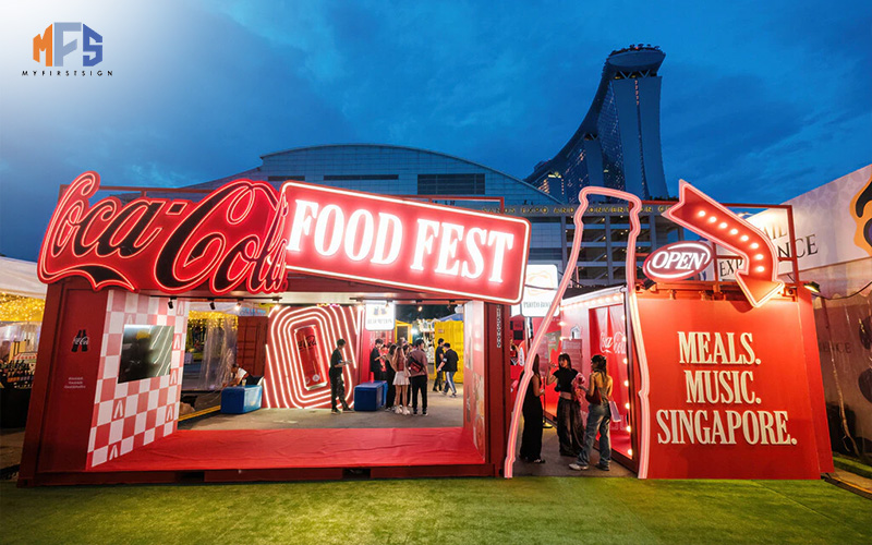
Maximalist signage takes a more expressive route to achieve visibility.
- Bold colours and strong contrast
- Oversized fonts or graphic elements
- Immediate impact from a distance
When applied thoughtfully, a more expressive signage style can capture attention without overwhelming the storefront. This approach is most effective when visual intensity is balanced with legibility, ensuring messaging remains clear even from multiple viewing angles. It often appeals to trend-driven audiences and brands that rely on high footfall and spontaneous engagement, particularly in lively retail clusters.
Retro vs. High-Tech Signage
Beyond visual intensity, signage can also communicate a sense of time, either by referencing familiarity or signaling innovation. These stylistic directions influence how modern, established, or experimental a brand appears within its surroundings.
Retro-Inspired Signage
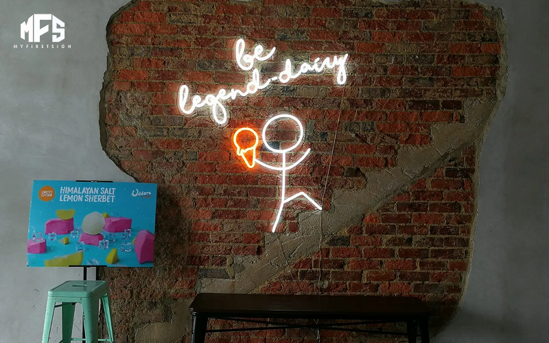
Retro signage draws on emotional recognition to create warmth and personality.
- Neon lettering and vintage-style fonts
- Nostalgic colour combinations
- A handcrafted or character-led appearance
This signage style works well for cafés, bars, and lifestyle concepts seeking to feel approachable and distinctive. By referencing familiar visual cues, retro signage can create a sense of comfort that encourages customers to slow down and take notice. In busy environments, nostalgic cues can encourage a brief pause just enough to spark curiosity through emotional connection.
High-Tech Digital Signage
High-tech signage prioritises adaptability and modern communication.
- LED screens and dynamic content updates
- Clean, contemporary visual language
- Messaging that can evolve throughout the day
This direction reflects efficiency and innovation, aligning closely with modern signage trends across Singapore’s retail and F&B sectors. Digital signage is particularly useful in fast-moving environments where information needs to change without replacing physical components. Brands pursuing this route often collaborate with an experienced LED signage supplier.
Luxury vs. Budget-Friendly Looks
Material selection plays a key role in shaping how signage communicates value and positioning. Customers often associate material quality with the level of service or pricing they should expect inside the space.
Luxury-Led Signage
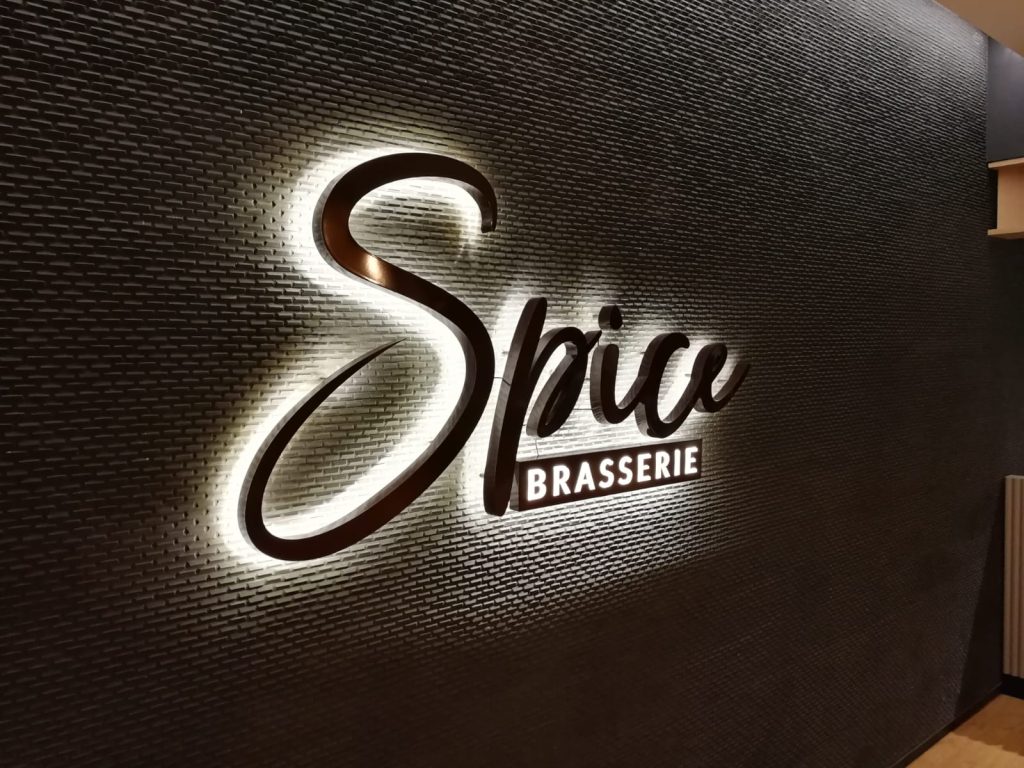
Luxury-oriented signage emphasises permanence and refinement.
- Metallic finishes and precision-cut lettering
- Subtle backlighting for depth and legibility
- A composed, high-end visual tone
This signage style is commonly used by corporate offices, medical practices, and flagship retail spaces where credibility and longevity matter. Well-executed finishes signal stability and investment, which can reinforce trust before any interaction occurs. Solutions such as lightbox signage, commonly used by businesses in Singapore, allow for consistent visibility without appearing overly aggressive.
Approachable, Artisanal Signage
More tactile signage can signal warmth and accessibility.
- Timber, textured surfaces, or hand-painted elements
- A crafted rather than mass-produced feel
- A neighbourhood-oriented visual identity
When executed with intention, this approach does not suggest lower quality. Instead, it communicates authenticity and care, which can be particularly effective for brands that prioritise atmosphere and personal connection. This positioning is often well-suited to cafés and lifestyle-driven spaces.
The Psychology of Colours in Signage
Colour is often processed before text, making it one of the fastest ways to influence perception in high-traffic settings. In crowded commercial areas, colour choices can determine whether signage is noticed or overlooked within seconds.
Common colour associations include:
- Red and yellow, which create urgency and stimulate appetite, a strategy famously used by McDonald’s
- Blue, which conveys trust and professionalism
- Green, which suggests calmness and balance
When applied consistently, colour strengthens recognition and supports broader visual merchandising strategies, helping customers understand brand intent within moments of visual contact. Poor colour contrast or inconsistent use, however, can reduce readability and weaken brand recall. In dense retail corridors, a cohesive signage style ensures the message remains clear even during brief exposure.
Conclusion
In a city where businesses compete for attention at every turn, signage plays a defining role in how a brand is perceived. The visual direction you choose influences whether a space feels premium or approachable, contemporary or familiar, and whether customers feel confident stepping inside. In high-traffic environments, signage also supports wayfinding, expectation-setting, and brand clarity, all of which affect customer experience before engagement begins.
If you are reviewing how your signage represents your business within busy commercial settings, My First Sign can support you with signage planning that considers design intent, placement, and long-term performance.